Correct the image before styling it
Different cameras and lighting conditions produce different starting points. First address exposure, white balance and unwanted colour casts. A balanced image gives you a more dependable foundation for creative choices.
Begin by checking overall exposure, the black point and the white point. These basic controls establish the tonal range before you make more selective adjustments.
A useful starting habit: Use a calibrated display when possible. An uncalibrated screen can mislead your judgement about colour and brightness, so evaluate both the image and its scopes.
A four-stage colour workflow
Primary correction
Establish white balance, black levels and the overall tonal range. These adjustments affect the whole frame and create a stable starting point for more selective work.
Secondary correction
Isolate a colour or part of the frame that needs attention. You might adjust a sky or refine skin tones while protecting the rest of the image.
Creative grading
Choose the atmosphere that serves the story: warmer or cooler, softer or more contrasty. Build the look on top of the corrected image.
Finishing and delivery
Review the result on more than one device before delivery. A television, phone and laptop may show different strengths and weaknesses in the grade.
Get comfortable with the core controls

Learn a small set of controls well before adding more. White balance, curves and colour wheels can handle a broad range of everyday corrections.
Curves let you shape different parts of the tonal range. You can deepen shadows while protecting midtones, or adjust highlights without changing every grey value by the same amount.
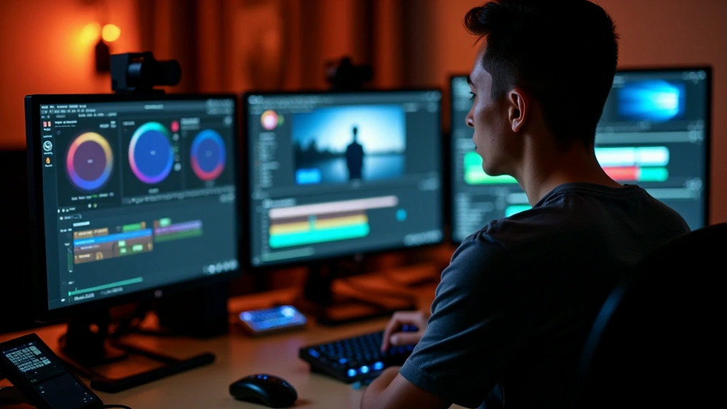
Colour wheels help shift the balance of a tonal region. A gentle move towards orange can warm an evening scene, while a controlled shift towards green can counter a magenta cast.
Use the histogram as an objective view of tonal distribution. It shows where brightness values gather and helps you assess changes alongside the picture.
Create a look that survives the cut
Once technical issues are under control, explore the atmosphere. High contrast and saturated colour tell a different story from a soft, muted palette. Choose what fits the footage.
Consistency matters as much as the look of one shot. Compare adjacent clips and bring them close enough that a cut does not introduce an unintended visual jump.
A practical shortcut:
Save a reusable look as a LUT when it suits your workflow. Apply it to compatible footage as a starting point, then adjust individual shots rather than expecting one preset to finish the sequence.
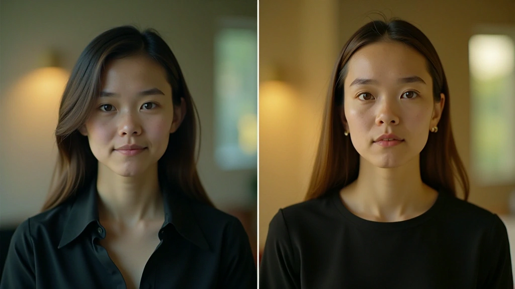
Common grading mistakes
A few recurring issues can make a grade feel less convincing. Review these before committing to the look.
- Too much saturation: Strong colour is not always better. Preserve believable skin tones and avoid pushing every hue equally.
- Neglecting the shadows: The black point shapes contrast. Check whether lifted shadows are an intentional choice or an unfinished correction.
- Rushing white balance: Establish a sensible white balance early so later colour decisions have a reliable foundation.
- Working without a reference: Compare with reference material and check other displays rather than trusting one screen alone.
- Overcorrecting: Several controlled adjustments are often easier to manage than one extreme change.
Keep the workflow manageable
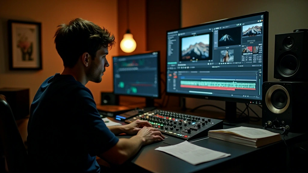
A consistent order of operations makes a grade easier to review and revise. Decide how you will move through the sequence before getting absorbed in one shot.
Work through primary correction across the clips, then address selective issues and the creative look. Resolve exposure problems before trying to disguise them with styling.
If playback struggles, lightweight proxies can help with editing previews. Check colour-critical decisions against the original media and the correct colour settings before final delivery.
Save settings and looks that work well. A labelled preset or version gives you a useful starting point for later projects and makes revisions easier.
Bring the process together
Colour work combines measurement with creative judgement. Exposure, white balance and tonal levels establish the image; the grade then gives it the atmosphere the story needs.
Primary correction, selective correction, creative grading and final review provide a repeatable route through the work. Practise the sequence on different footage until you can recognise what each stage needs.
Note: Progress varies from person to person. Colour correction takes regular practice with different footage and lighting conditions.