

Build a better timeline: a practical guide to editing
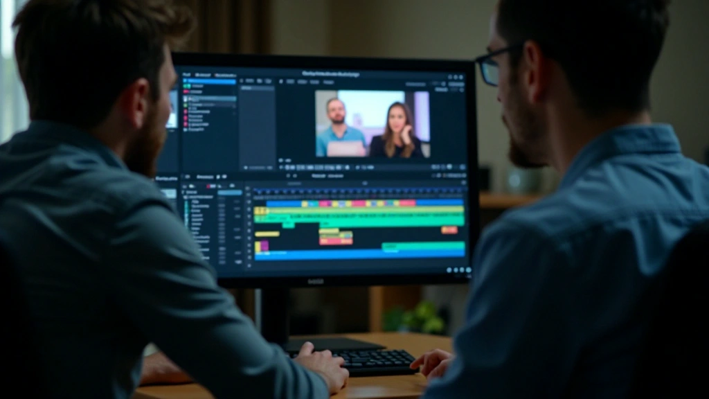
Organise clips and choose transitions that help your timeline tell a coherent story.
Read the articleUse animated titles, considered transitions and visual effects to give your video direction and rhythm. This guide starts with simple moves that support the story.
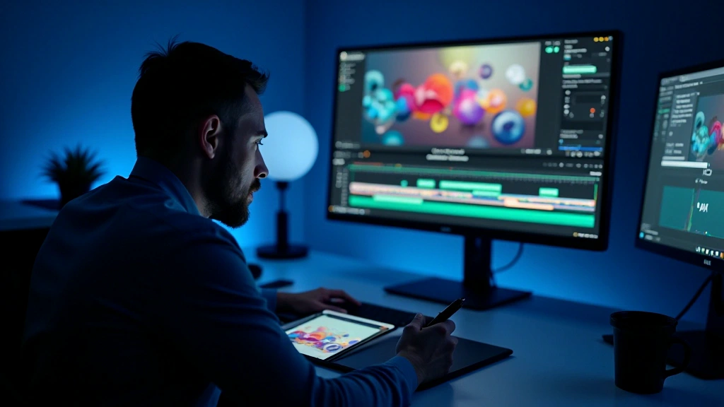
Motion graphics can direct attention, establish pace and make information easier to follow. Their value goes beyond decoration: a well-timed graphic helps a viewer understand what matters in the scene.
A title can introduce a speaker, a transition can connect ideas, and an infographic can explain a pattern. Decide what an element needs to communicate before you animate it.
Let the viewer register the text before moving on. A useful starting point is an entrance lasting roughly half a second to one second, followed by two or three seconds of stillness. Adjust the hold for the amount of text and the pace of the scene.
Templates in tools such as After Effects or DaVinci Resolve can be a starting point. Adapt their colours, timing and typography to the project instead of leaving every default in place.
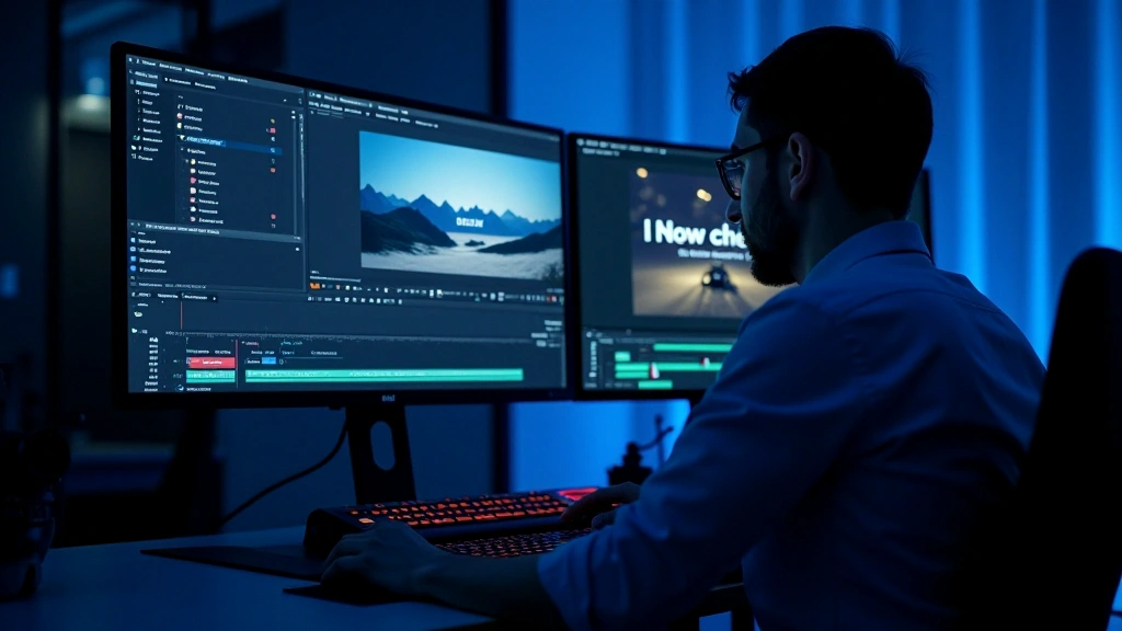
A transition should help one shot lead into the next. Try a short duration, around 0.3 to 0.5 seconds, as a starting point and watch it at normal speed. The story and rhythm determine whether it needs to be longer or shorter.
Dissolves, restrained zooms and lateral moves can work when they match the scene. More elaborate effects need a clear reason; otherwise, they can pull attention away from the subject.
Use easing to shape acceleration and deceleration. An ease-in-out curve often feels more natural than a constant-speed move, but preview it against the action rather than relying on the preset alone.
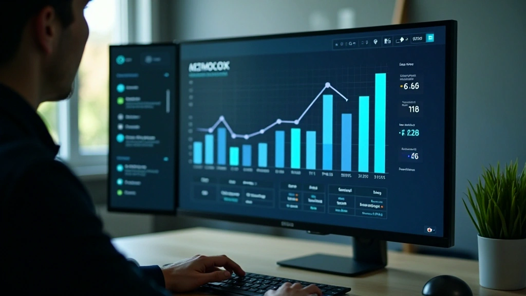
Animation can reveal information in a useful order. A number counts up, a bar grows, or a label appears just as the narration mentions it. The sequence helps viewers follow the relationship between the facts.
Design the graphic as a static composition first. Separate the elements into layers, then introduce them in a deliberate order with small timing offsets. Check that the finished sequence is still easy to read.
Group graphic elements by topic or order of appearance
Try offsets of 0.2 to 0.3 seconds between elements to reduce visual crowding
Watch the complete move and simplify any section that feels rushed or confusing
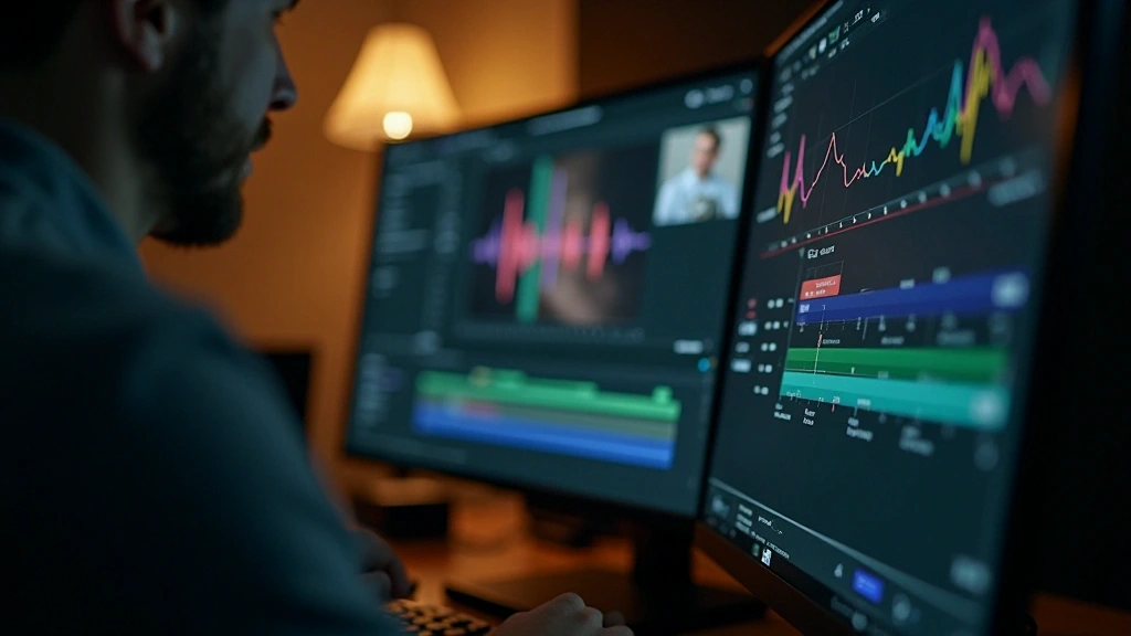
A graphic can feel disconnected when its timing competes with the music or voice. Matching important moves to useful audio cues helps the whole sequence feel intentional.
Listen for a beat, a vocal emphasis or a change in the narration. Place the animation on that cue, or slightly ahead of it when the viewer needs time to read.
Try placing major moves on musical downbeats and introducing titles when the narration changes topic. A few deliberate cues are often more effective than constant movement.
Start with consistency, timing and the relationship to sound. A simple title with a clear hold and well-shaped easing is a useful first exercise.
Build a few moves of your own, test different durations and compare them against different soundtracks. Keep asking whether the animation makes the message clearer. Remove what does not help.
Results depend on the software, equipment and experience involved. Treat these techniques as starting points and adapt them to the needs of each project.
Short, deliberate moves often communicate more clearly than long, elaborate ones. Leave enough stillness for the viewer to read.
Author
Editorial Team
Written by the Montivelle editorial team, with a focus on clear, practical post-production learning.
Organise clips and choose transitions that help your timeline tell a coherent story.
Read the article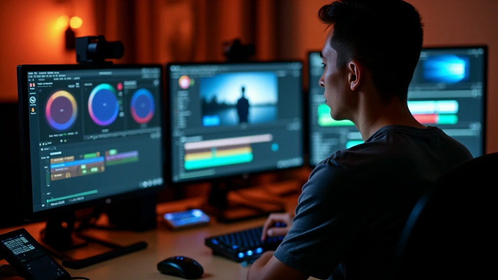
Explore white balance, colour curves and the practical stages of a grading workflow.
Read the article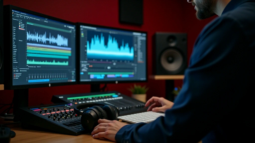
Align the soundtrack, control competing levels and build a mix that supports the picture.
Read the article